
Deviation Actions


Description
$30 Painting Commissions
I'm not exactly strapped for cash yet. I've been relying on my credit card heavily lately and I can't exactly do that forever. I haven't been going to my job a lot lately because it's winter and there's not as many hours. Also, I haven't been asking for more because I just don't feel good going there. Not to sound like a sob story but I've been real heavy into the situational depression and have only really started addressing my anxiety problem. It's only gotten worse since my dog passed away two weeks ago. I had the crudiest week at work last week. I broke down in front of my one supervisor one day and told him all this and he gave me a number to a hotline (bless him), the next day I got in a fight with my other supervisor for berating one of my other coworkers to the point where he was close to tears, the next day my foot was killing me and I was limping around all night xD I really need
:origin()/pre00/a4e0/th/pre/i/2016/364/5/4/nature_sketch_cover_by_marylandlovely-dathumu.png)
:origin()/pre00/639b/th/pre/f/2016/334/b/f/creature_by_marylandlovely-daq485p.png)
:origin()/pre00/04cc/th/pre/f/2016/312/e/7/mannequin_by_marylandlovely-danqjiz.png)
:origin()/pre00/eb2d/th/pre/f/2016/364/4/b/self_portrait_by_marylandlovely-dathzkx.jpg)
:origin()/pre00/3158/th/pre/f/2016/291/3/3/birds_final_by_marylandlovely-dalfskl.png)
:origin()/pre00/771c/th/pre/f/2017/177/0/4/04d8fd3071a2fbb8d27244e43cfce297-dbe5hzb.png)
Check me out on Twitter Pinterest Tumblr Instagram & YouTube!!!
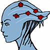
For my final project in colour studio I had to do a self portrait. I needed to use thre colour theories/concepts that we learned that semester.
1. Colour Interactions | Melting Borders: Melting borders can either be colours slowly melting into each other to create a gradient effect or two colours with no outline which seem to have one regardless because of the way our eyes flicker. I applied this by creating a gradient of light to dark with the blue. I chose this to help separate the limbs from the rest of the body.
2. Colour Contrats | Saturation/Light and Dark/Hue: Colour contrast can be a variety of thinfs. Complimentary, hue, cool & warm, etc. I applied this through the use of hue, saturation, and light & dark. I chose these colours to help blue stand out and also because of the contrasating emotional undertones they all have.
3. Colour Harmonies | Triad: Colour harmonies are when you pick colours because of how they relay to each other on the colour wheel. A triad is picking colous that create an equilateral triangle. Complimentary are opposites. I applied it through a triad. I chose this to make the composition pop.
The blue expresses how I feel a lot of the time. The yellow is how I express myself to the world. The red is the world around me. The composition is the story of how I came to love myself and how it was a long time coming and still a work in progress. People may think that skinny equals confident but that is not always the case and personally I believe that is an ignorant way of thinking. Really it’s a story about how I’m the only one who needs to understand and appreciate myself. Funny enough, when I began to do so, the people around me began to as well.